How To Build A Website With A High Conversion Rate
There are numerous things to consider when building a website. It’s not just about making it look good, it’s also about converting visitors into paying customers. In this post, I will show you the key ingredients to building a successful website that converts like a charm.
Before going into details, here are some interesting facts you should know:
- You have 10 seconds to convince your visitor that your website is compelling. If the first impression is bad, the majority of visitors leave and never return.
- A/B testing can help you decide what design works best. It’s not just about what you think looks good. By consistently running tests, you can improve your conversion rate and make your website shine.
- A website must have a clean and simple design. Make sure the most important information is easy to find.
- Website speed is directly correlated to how the website is structured and how it is designed. A one second delay can have huge consequences in your conversion rate.
Without any further ado, here’s how to build a great converting website.
1. Use powerful headlines to send your message
A good headline is very important to tell your visitors what your company does. It is the first part a new user sees when lands on your website and it’s critical to catch their attention in the first few seconds.
While there is no secret formula to writing headlines, think what resonates best with your customer’s needs. Give them a reason to try your service. Run A/B tests with different variations and use the headline that converts best.
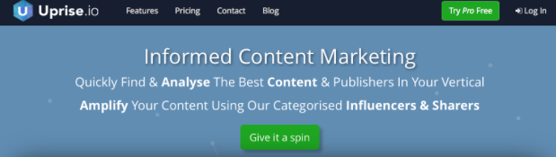
Here’s an example of a good headline from Uprise.io. In just a few words, they gave plenty of reasons for you to try their product.
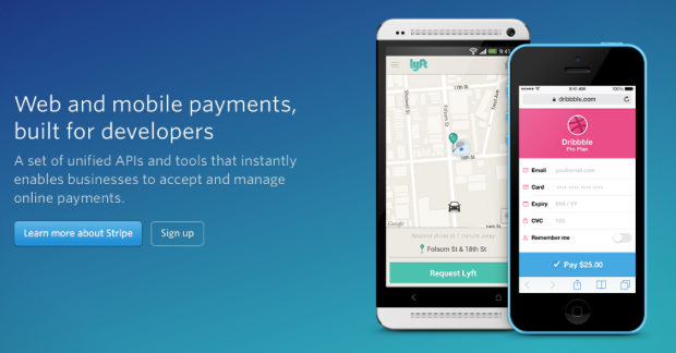
Another great example is from the payments service called Stripe. With a simple headline, they introduce you to their platform and you can already get familiar with that they do.
2. Use Call To Action buttons
Catching your visitor’s attention is not everything. You should also find ways to get them into your system and eventually convert. Use call to action buttons and convince your visitors to try your product. Some of the best buttons variations are:
- Sign Up Free
- Free Trial
- Start Free Trial
- Start Free Account
- Register For Free
- Give It A Try
- Try It Now
- Get Started Now
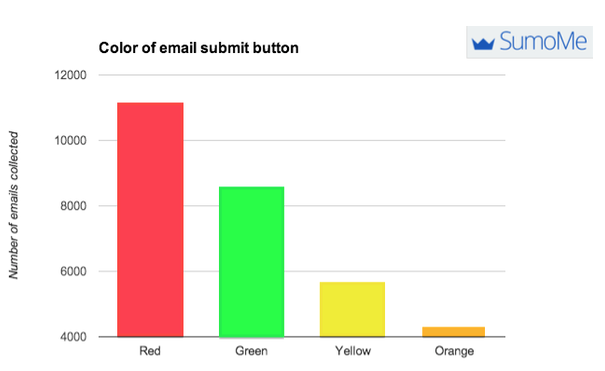
Another important thing to consider is the color of your buttons. Many studies, including one from SumoMe suggests red buttons convert best. Green and yellow are performing good also.
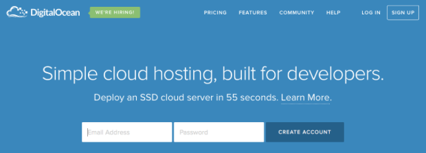
Keep in mind that a call to action button doesn’t necessary has to be a button. It can also be a sign up module. For example, look at how DigitalOcean is allowing their users to start a new account simply by entering their email and password.
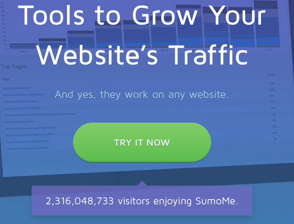
Another example of a call to action button that stands out is SumoMe. With a large green button, it’s almost impossible to miss.
3. Let people see and try your product
Always show the product to your users. Give them screenshots and make a video tutorial showing the main strengths and benefits of using your tool. Selling online services is similar to selling in a physical store. Users want to touch and test the product before buying.
It’s true that you can’t touch a digital product, but you can at least make a better idea about it, by looking at some screenshots and videos.
4. Use a clean and simple design
There is no reason to pile everything in one page. Actually, the more landing pages you have, the higher the chances to convert your users. When building a new website, use a very simple and intuitive design.